[su_note note_color= »#dadbdf »]
FOREWORD
This article is a reaction to the one I posted last week under the title « Form and Substance » that you can find at this address (in french):http://www.photofolle.net/le-fond-et-la-forme /
The discussion had already begun in the comments which I urge you to read by way of a preamble! Quite exceptionally it is not I who wrote the article, but Jean-Paul who honoured us with an excellent article on the photographic image.
Over to you, Jean-Paul![/su_note]
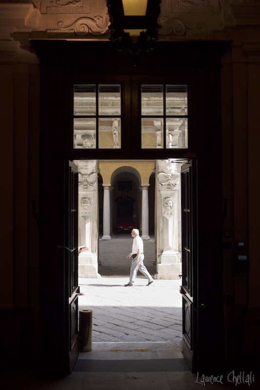
The original raw file
So here I am facing this image, by the vagaries of chance, without having a preconception in my head.
And immediately this photo speaks to me. It speaks volumes. Almost as much as, or perhaps as much as that to which I had previously responded – your famous « Italian Wedding. »
I will return to your comments on your own photo which is not without interest, for my purpose as well. But for now, I would first like to redeem it; first in your own eyes and also, additionally in the eyes of those to whom you have shown it.
Your photo as you’ve approached it thus far: framing; composition; lines of force; colour; light. High contrast with washed out whites and blocked blacks, does not make us want to preserve it, nor does it cause us any compelling interest. No interaction between the subject passing by, and the environment, as you say. A rather ordinary picture.
This is a veritable indictment which presages the axe: delete it with no regrets. Yet you have not been able to resolve yourself to do so … Why?
It is from this position that I begin my remarks. You did not delete it because it is much more significant, stronger and more successful than you realize, even if you do not (yet) know the reason. Why is that?
First, your choice of colour.
It beggars the rules of photo processing to announce all is lost, as you do . I do not have the original raw format, but I’ve already submitted your photo, as found on the Web, to some tortures using « Lightroom. » It is quite honestly recoverable as I will show below.
No doubt, the photo benefits from remaining somber, to eliminate what detracts from it: the meters and electric boxes to the right, and above all, the car at the bottom, in the middle of the scene, which would cause one to hesitate to press the shutter release, and which is very noticeable in your photo as published.
You leave this photo very somber and very contrasty; and there you are infinitely correct. So, leave it in the shadows, with a high level of contrast. This is a good choice.
You then convert it to black and white, and there again I follow you perfectly – colour detracts from the purpose of the photo, and contributes nothing. Let us therefore focus on the essentials. Take advantage of the darkness to make the car disappear. Again I follow you perfectly – one less big problem.
After this comes my first point of divergence.
As you yourself say, the bright spot at the top really distracts ones attention, and further, that « the highlights at the edges of a photo invite ones eyes to leave the frame. »
Enough said!
Then, what prevents you from cropping out the distracting part? Yet you don’t do that, thereby suggesting it is much more import than it seems. I will return to this point, but to simplify my demo I will proceed with the hesitancy of a debutant in photography.
So, I re-frame the black and white photo while increasing the contrast, to completely eliminate all unnecessary items, as I show below (we could also take this opportunity to eliminate the car unless it also has importance I did not take the trouble to discover.)
Thus remains a photo with a frame within a frame, the better to focus attention on the subject.
Here is an impossible case which, in my opinion, this is all about.
This is not the first time I have questioned your choice of framing and this particular case raises a number of questions with me:
After cropping, the composition …
The passer-by, as you say, is almost perfectly centred in the photo. You have already demonstrated your capacity for perfectly symmetrical framing (Italian wedding …) however here, everything is almost centred, but nothing really is, which is very disturbing and destabilizing to the eye. And it is not neutral …
The symmetry of the columns in the background between the two columns in front, which lie behind the third « colonnade; » the doors in the foreground, yet again symmetric. And amid all this, planted in plain view, this passer-by not at all in the centre, unlike « almost in the centre » as you stated in your commentary – he is at the centre of the photo, not of the columns, and this is very disturbing. Finally a trash-can in the left foreground (and none on the right to provide symmetry), and this person almost outside of the picture to the far left of the door frame. We finally see only this – the apparent symmetry is completely asymmetrical and unbalanced! Vertically, it is even worse: two square sources of light with only a plain black bottom to answer to them! (Not to mention what I previously cropped to simplify my point.)
And what if all this finally gave the composition a phenomenal strength caused by the imbalance of an apparently frozen image (being symmetrical and ‘harmonious’), which it actually is not at all?
To be honest, what I see here is a veritable movie, with camera movement , a continuous panning shot of the camera in depth through these three successive planes of colonnades, during which unfolds the lateral traverse of two people whose fates will cross/overlap, one almost out of the field of view, which introduces the concept of time into this picture, traveling from left to right, and the other, uncentred, no longer to LEAVE THE SCENE TO HIS SHADOW, is walking from right to left.
And he has a decided look, this guy, which is what struck me most on first glancing at this picture.
He too introduces the concept of time by his « non-centredness. » He is a man walking without hesitation, with determination. One can imagine, by the same token, the following picture you may have taken and not kept, a fraction of a second later: the passer-by is well centred but this time the composition is less harmonious. The shadow on the ground is truncated, the figure on the left, although more nonchalant, moves a little deeper into the scene, which gives him more (too much?) importance. Moving ahead in time, the shadow now falls at the border of the frame. The setting is thus reduced and the trash-can, once so important, perhaps begins to be truncated. It will in any case be in the next image where the person on the right moves away to the left, while the the person of the left occupies the centre of the frame – and the door, traversed by the camera disappears …
Now that we saw the(se) attachment(s), let’s pass on to the essentials: the characters inside and out of the field of view and the « unsightly and unnecessary boxes on the wall to the left, and finally, the trash-can that appears « like a hair in your soup, » as you say.
The symbolism
You describe the main character as almost perfectly centred (but its this « almost » that changes everything …) to the « tidy » look, straight and balanced …
I do not have the same feeling at all. Certainly he stands out perfectly well, I agree with you, and his legs are well separated (a moment later when he would be perfectly centred, it would not be the case for his legs) but it’s his determined look that hit me and spawned this film I made up in my head. This film, which can only work with a normal Western reading direction from left to right and not from right to left, or top to bottom. Here it is:
This man returns resolutely toward his past, which he previously messed up through negligence: the man at the left, barely visible, walking nonchalantly reading his newspaper without paying attention to what is happening around him and therefore his future (left to right), that’s him, as he had previously neglected himself. The two columns on either side form a triangulation of the three heads: those of the two lions and his. The diagonal formed by his silhouette and his shadow directs ones gaze towards the head of the lion to the left in the shadows, which makes its extended tongue disappear, which is clearly visible in the sun on the lion to the right. Disappearing, it shows more so the scowling face of a failed past to which we must return to fix it, to avoid producing once again the head that sticks its tongue out at our failed future, like those mocking or frightening effigies or gargoyles that we contemplate on the facades of the churches. So he retraces his steps, determined to revisit the past that, by his stupidity, he neglected when it was most necessary to pay it attention, as if he had thrown it in the trash-can, PRINCIPAL SYMBOL of the meaning of the image as shown by its opposite triangulation, marking even more this wasted past: this unhappy lion, placed by symmetry in the trash-can of an unfulfilled past…
I return, finally, to my original cropping, which I can now qualify as largely excessive.
Since Laurence knows how to crop a photo, and is not a beginner, the fact that because he leaves the image with its bright upper left part, which amounts to a distraction to the reader, I can only conclude that it was done voluntarily, even if unconsciously.
Just as this trash-can symbolizes a disastrous oblivion of the depths of the past, this rising light in the top left, marks the profound optimism of this photograph: in returning with such commitment to his past, this gentleman will enlighten it to the betterment of a past that he had unwisely undertaken. Illuminating his past history, he will brighten his future, thus enfeebling the lion sticking its tongue out at the present. It is therefore essential to reintroduce it into the final version, because it is the final signature of this photo: we do not come out at the bottom right as the normal reading direction would have it, but at the top left, to the symbolic significance which illuminates the meaning of the photo, which is anything but ordinary …
So let’s leave this photo to end the sequence by traveling backward, to a scene deserted by those now distant passers-by, leaving nothing but the floor in black white contrast, the lions and the lonely trash-can, and this beautiful bright light bursting out at the top left when our travel back in time ceases.
Clap – end of the film.
I remind you that all this interpretation is just a game … But what was it, that title? Ah yes: « Form and Substance. » …
You can read the second part here
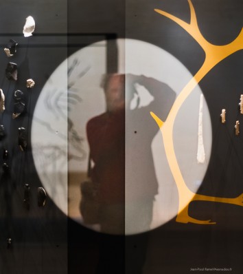
[wc_box color= »secondary » text_align= »left »]ABOUT JEAN-PAUL RAMEL As a biography, John Paul gives us a self-portrait. If we have well and thoroughly followed his approach to reading an image, I think everyone can easily form some impression of the author. 😉  [/wc_box]


L’article de Jean-Paul a fait un émule anglophone qui nous a fait l’honneur et la surprise de traduire cet article en anglais que vous pouvez retrouver ici en langue française : http://www.photofolle.net/le-fond-la-forme-par-jean-paul-ramel/
[…] As a reminder, the initial article in which I ask the questions that Jean-Paul answers is this: http://www.photofolle.net/forme-and-substance-part-the-first/ […]
International Carole… Mais ça, on le savait déjà ! Chouette. Jonas.